Why I love Causal so much
Causal is a pretty incredible tool for financial forecasting. While I’ve been using it for business forecasting for 4+ years now, I’ve also found it really useful as a general purpose spreadsheet alternative anytime I need to deal with complex time-series oriented data. For example, I’ve used it for reviewing my personal time management data. In this post, I’ll highlight some of the features that I find particularly impressive.
(This post is not sponsored in any way. I just figured someone might find it helpful, so I’d share about it.)
Handling uncertainty #
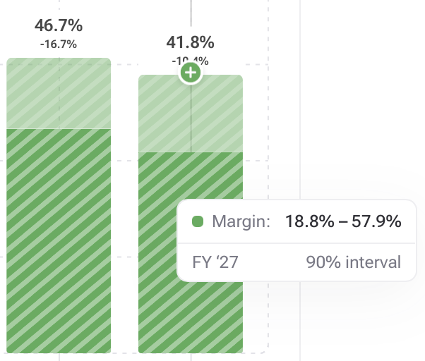
Unlike a traditional spreadsheet, Causal allows a cell to contain a range of potential values. For example, a financial forecast can estimate that employees will work 10 to 30 billable hours each week. Later, if this value is used in a formula, the probability range carries through.

In fact, charts even shade the plots based on the 90% confidence intervals.

Value Categories #
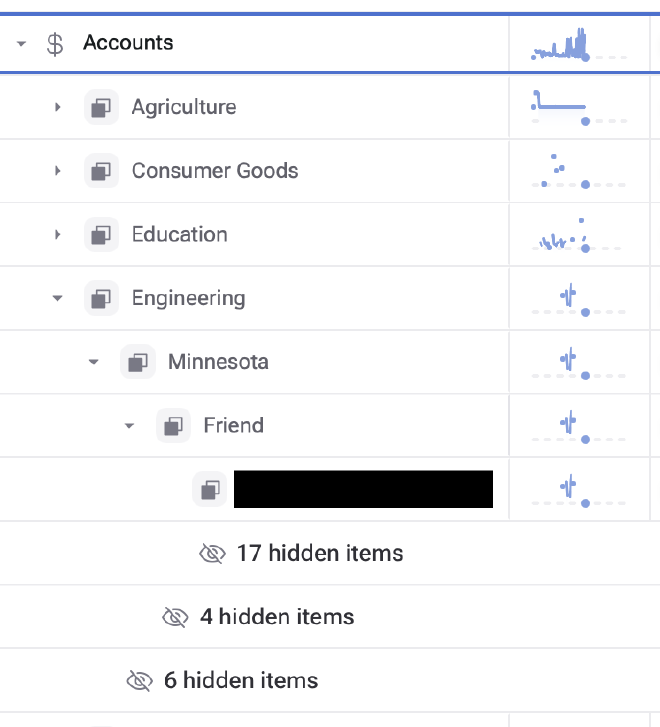
Each value can be subdivided by one or more categories. Later, formulas and charts can reference the value either aggregated across all the categories, just one category, or a single category. For example, here’s a value that’s subdivided with three category levels: industry, location, and source.

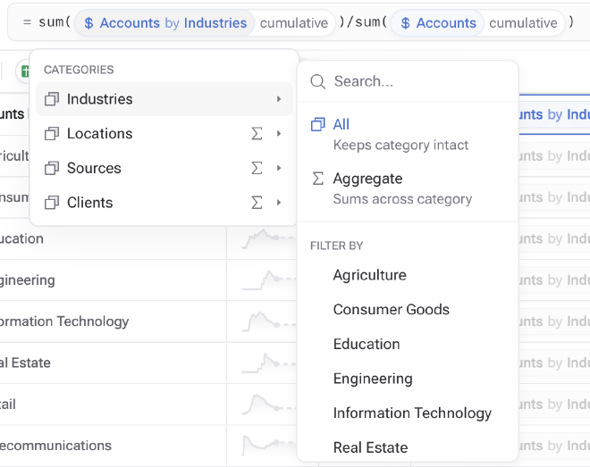
Later, a formula for calculating the percentage of accounts by industry can aggregate by location and source, leaving industry non-aggregated, so that we get a breakdown by industry.

Data Sources #
All values can be linked to a real data source. Causal supports several different data organisation styles (time series, transactions, etc) which makes it easy to pull in nearly any kind of data. Causal will then automatically aggregate the data by the model’s time interval (e.g., by month). Once a value is linked to a data source, Causal will use the “real” data values and automatically switch to the formula when there isn’t any more data (note the icon next to the value that has data).

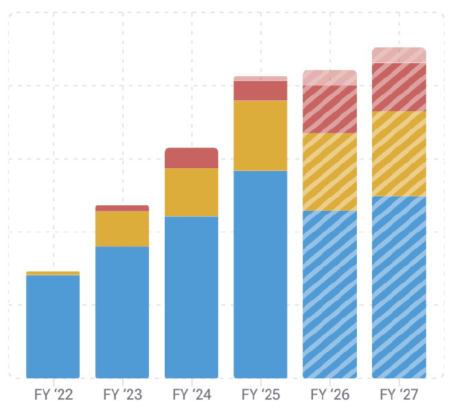
This allows charts to show both actual data and forecasted data at the same time. When the real data runs out, the forecasted data shows hashed and faded.
